
I contributed writing and images to Turba Tol Hol-Hol the book, which is available now. Edited by Carla Macchiavello Cornejo
A Collection of Writings / by Jonas Mekas and His Friends EDITED BY: Charity Coleman PRINTED BY: Calipso Press PUBLISHED

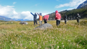
In the inaugural issue of the River Rail there are articles by four Ensayistas: Christy Gast and Bárbara Saavedra, Admiralty Sound Expedition Report
The anthology “The Wild Living Marine Resources Belong to Society as a Whole” contains a wide range of expressions: poems,
“Dear Enemy: Interspecies Communication through Artisinal Scents,” Pioneer Works Journal, July 2017, pp. 94-109 Co-authored by Christy Gast, Camila Marambio, Giorgia Graells
In Tierra del Fuego, where the Atlantic meets the Pacific, land and sea are not so much interwoven as fractured—splintered
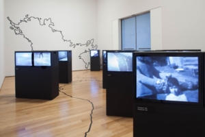
Essay on Juan Downey's Video Trans Américas for Miami Rail
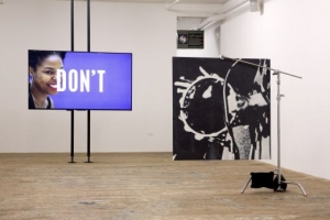
In advance of Martine Syms’s public project Nite Life, which will appear on buses throughout Miami this winter as part
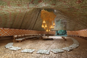
ERNESTO NETO AND THE HUNI KUIN ARU KUXIPA: SACRED SECRET CHRISTY GAST THYSSEN-BOMEMISZA ART CONTEMPORARY, VIENNA JUNE 25–OCTOBER 25, 2015

Flat Rock at the Museum of Contemporary Art, North Miami, is Virginia Overton’s first solo exhibition in an American museum.